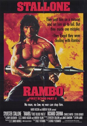
My target audience is action movie fans. Everyone has there different taste - but i think that i can appeal to all of them by mainly showing mine as being related to action movie fans - because they are the one more likely to want to see my films (they are typically older mid 20's to 30's which think would be the main audience which is also the main audience would be Rambo film fans) - that would return for another one or action film fans that like Sylvester Stallone.They would more than likely the type of people that would watch this film the location is weird because if this is a film this would be released world wide. There hobby's would be actin films and more than likely gaming and would play call of duty and battlefield as well as interesting in the same group of actors and genre of film.The gender is typically male although i know that a lot of women would come and see it for the same reasons stated above as for ethnic group i believe that it would be open to every one and not targeted towards a certain group of people or ethnicity jobs typically the type of job could be anything and it doesn't really matter to me but it is important to the research but i think that they would be soldiers potentially as well as i think that it could be a chef which in my experience are typically action film fans or it could be a media teacher or teacher in general who liked the originals or the actors and it would appeal to them because its what they liked and would want to see the new films.
The rest of this question are stated below so that i do not have to repeat my self and copy and paste it again and again.
and my two ideas were and action poster
Which is where i decided to go and where i was going to ultimately go with because i think that it is very better and i think that it is more me but my other idea was my original poster idea which was a super hero action poster but i could have originally gone with a game poster which is my bread and butter which i like and i feel like i could do a lot with but i ultimately went with a action war film poster but i think that it is quite good and i am happy with what i produced.
research( other posters that i looked at )


These are the sort op poster that i looked at because this was the style that i looked at and what i wanted to go with with visuals and colors schemes as well as i thought that it was good and this related to my target audience because this is the time period and genre that i focused on when i was thinking about my poster making look how i wanted and sort of relate to.
Target audience
"my target audience is everyone in the group because everyone has there different taste but i think that i can appeal to all of them but mainly i ma showing mine towards action film fans such as Patrick and Nathan because i know that they are action fans"


These are the images that i thought of and i actually made and this is what my final idea came out as and how it was presented after i had done everything that i wanted to use and it was very good in my eyes this also shows the grid structure which is very good and what i needs to have.
Graphics
The main images are Rambo in the main center stage as well as i had an age rating as well as i had a dense jungle area for setting as well as it which is where most Rambo films are so i thought that i would stick with the culture but i think that it worked as well as i had a explosion on both sides as well as i had a small helicopter in the top left and corner and i had the main text in the middle and that was ll the graphics as well as i had color i had red text because it is what is commonly used during all posters as well as i wanted it to be aggressive and violent but i think that it did it well and that it looks how i wanted it to be and how it should have looked for the theme that i was going for.
The graphics for my final poster are above the text and how it finally turned out
Action plan
If i had to change or redo anything i thin that there is nothing that i would change honestly but i think that if i really had to change i would mess around with masks and i would go with more detail with masks so that i could have a more realistic feel by messing around with the brightness and contrast with masks so that it could have a better and more realistic feel with it and so that i could have bigger understanding but i think that it could have a better feel and atmosphere with it.
The rest of this question are stated below so that i do not have to repeat my self and copy and paste it again and again.
and my two ideas were and action poster
Which is where i decided to go and where i was going to ultimately go with because i think that it is very better and i think that it is more me but my other idea was my original poster idea which was a super hero action poster but i could have originally gone with a game poster which is my bread and butter which i like and i feel like i could do a lot with but i ultimately went with a action war film poster but i think that it is quite good and i am happy with what i produced.
research( other posters that i looked at )


These are the sort op poster that i looked at because this was the style that i looked at and what i wanted to go with with visuals and colors schemes as well as i thought that it was good and this related to my target audience because this is the time period and genre that i focused on when i was thinking about my poster making look how i wanted and sort of relate to.
Target audience
"my target audience is everyone in the group because everyone has there different taste but i think that i can appeal to all of them but mainly i ma showing mine towards action film fans such as Patrick and Nathan because i know that they are action fans"


These are the images that i thought of and i actually made and this is what my final idea came out as and how it was presented after i had done everything that i wanted to use and it was very good in my eyes this also shows the grid structure which is very good and what i needs to have.
Graphics
The main images are Rambo in the main center stage as well as i had an age rating as well as i had a dense jungle area for setting as well as it which is where most Rambo films are so i thought that i would stick with the culture but i think that it worked as well as i had a explosion on both sides as well as i had a small helicopter in the top left and corner and i had the main text in the middle and that was ll the graphics as well as i had color i had red text because it is what is commonly used during all posters as well as i wanted it to be aggressive and violent but i think that it did it well and that it looks how i wanted it to be and how it should have looked for the theme that i was going for.
The graphics for my final poster are above the text and how it finally turned out
Action plan
If i had to change or redo anything i thin that there is nothing that i would change honestly but i think that if i really had to change i would mess around with masks and i would go with more detail with masks so that i could have a more realistic feel by messing around with the brightness and contrast with masks so that it could have a better and more realistic feel with it and so that i could have bigger understanding but i think that it could have a better feel and atmosphere with it.
Comments
Post a Comment